11 hidden meanings in famous logos that you didn’t know
Read on to find out the hidden messages in brand logos you know and love!
Logos are more than your name and an image. They are your identity. They represent what you stand for, who you are and, sometimes, what you do.
However, with logos there is often more to see than first meets the eye. If you look closer, you may see a few hidden messages in logos you know and love.
Here are 11 of the most recognisable logos with hidden meanings.
Unilever
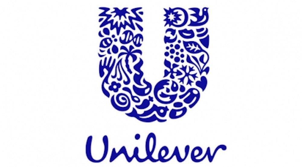
The global FMCG giant, Unilever often uses strong, colourful promotional pieces to advertise their company and their products.
However, their logo is one of their biggest showcases for their business and a great example of hidden messages in logos.
Look closely and you will see many different items which piece together to create the iconic “U”. These symbolise the markets they work in and the products they sell.
Toblerone
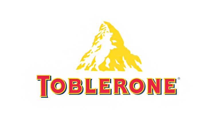
This chocolate bar has been gracing our shop shelves and lining our stomach for a long time. But do you know the hidden message in this logo?
The Swiss chocolate company appears to be very proud of its roots from the hidden message in this logo. The mountain you see, symbolises the Matterhorn Mountain in Switzerland. However, look closer and you will see a bear hidden within the mountain. This is to symbolise the unique honey flavour of the chocolate as well as the fact it is made in the “City of Bears”, Bern, Switzerland.
Audi
Most people can recognise the four rings of Audi, but do you know why there is 4?
The 4 rings actually represent the 4 companies which came together and amalgamated to create the original Audi, Auto Union. The logo symbolises unity and teamwork.
LG
It is likely you will recognise this technology giant; you may even own a TV, fridge or other appliance made by them. But have you ever noticed that, within the red circle of the logo, there is not only a smiley face, which makes the brand appear more human, but also the letters L and G.
These hidden messages help LG to appear more approachable and inviting.
Adidas
Another famous brand with a hidden message within the logo. It may be obvious that the stripes look like a mountain, but do you know why they chose a mountain?
It represents the obstacles and challenges faced and overcome by athletes every day.
Gillette

Gillette promotes their razors as being precise and sharp without damaging the skin and their logo’s hidden meaning represents these values.
The precise, clean slice taken out of the top of the “G” and the “I” makes the logo look like an extra sharp Gillette razor has been at the logo. Therefore, even their logo has had the Gillette treatment.
Apple
Potentially one of the most iconic logos on our list, the Apple logo is thought to have originated from the original Adam and Eve story from the Bible.
The fruit is supposed to represent the apple from the Tree of Knowledge and the chunk taken out of it symbolises where Eve bit into it.
Beats
At first look this logo may simply appear to be a circle with a “b” in it to represent Beats. But look again as this brand is implementing a clever hidden message in their logo.
The red circle represents a human head, and the “b” is actually a pair of headphones.
This not only makes the brand more personal but helps consumers imagine themselves wearing a set, whilst the red helps to further evoke desire and love towards the brand.
Pinterest got their idea for the name from the idea of pinning things you like to a board which is reflected not only on their platform but also their logo.
The “P” represents a push pin which merges the idea of real-life pin boards merging with digital ones.
Amazon

You may not be surprised to hear that Amazon are now the world’s largest retailer. Their combination of a fast delivery cost effective range of products with a simple user interface was always going to put them ahead of the competition. However, do you know the hidden meaning in this logo?
The yellow arrow is the key to it all. Firstly, it starts under the letter “a” and ends at the letter “z”, highlighting that they sell everything from A to Z.
Then, if you zoom out, you may notice the arrow also looks like a smile, with the arrowhead looking like a dimple. This is used to represent the happiness felt when shoppers use their service.
We couldn’t talk about logos without discussing one of the most recognisable ones on the internet, Google.
Their use of colours represents that they don’t conform to rules. They kept with the primary colour palette for the majority of their letters but broke this with the one secondary colour, green. The colourful letters also help them come across as a fun brand.
How many of these hidden messages were you aware of? This proves that the work which is put into creating a logo is much more than simply colours and pictures.
Our experience in creating strategies and logos means we have a good understanding of what a company needs and the importance of colours, imagery, and messaging.
Our creative marketing teams work together to combine all these elements to support you in creating a strong brand to help raise awareness of your company and help you stand out.
Contact us today to find out how we can help you build your brand strategy and create a strong, meaningful brand.