How to choose the right colour palette for your brand
In this post we will show you how to choose a colour palette for your brand and how this can influence your consumers in a way you may not even be aware of.
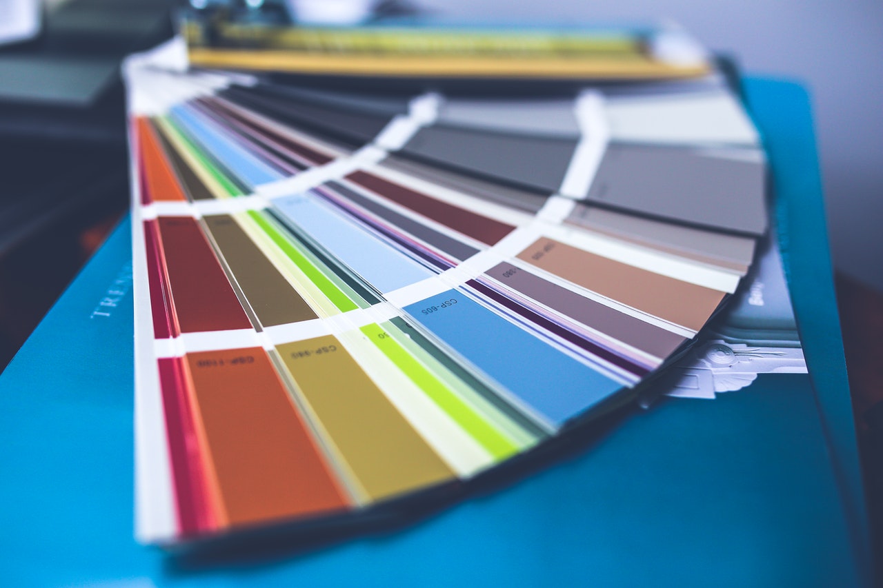
When it comes to picking a colour scheme for your branding; you may go straight for what you and your design team think looks good, or perhaps just your favourite colours.
However, the colours you choose will have a big influence on your customer’s perceptions and feelings towards your brand. So, this should be taken into consideration whilst deciding on your colour palette.
How do I choose a colour palette for my brand?
One of the most important things to consider before you start looking at those colour schemes is your company.
Think about your brand values and your audience. Consider how your products or services will benefit your consumers and how you want them to feel when they see your brand.
Do you want them to feel impulsive and in love with your product? Or do you want them to feel serene and calm when they think about your brand?
This is particularly important to think about it as it will help you correspond to the relevant colour palette.
Colours and emotions – a deeper connection than you think
Once you have thought about the emotions you want your consumer to feel when they see your branding, you can then link it to the appropriate colours.
Each colour has a certain feeling or feelings which are evoked, and we will cover a few of the primary colours here.
Red

When you think about the colour red what do you think? Love? Lust? This colour is often used to evoke hunger, desire, and impulse, so is perfect for those brands wanting their consumers to be impulsive in their purchase.
Yellow
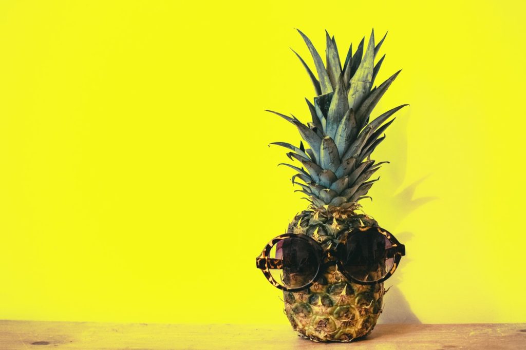
This colour is used to evoke happiness, calm, and enthusiasm. It is also the first colour seen by the retina, so it is great for grabbing attention.
Blue

According to a recent YouGov survey, blue is one of the most popular colours in the world.
It is seen as the colour for communication and different shades evoke different feelings as well. For example, light blue often evokes fantasy whereas dark blue is linked to authority and power. Blue also evokes feelings of tranquillity and calm.
Purple

The colour purple has always been connected with luxury and royalty which dates back to an aged old tradition where people would wear purple clothing to show their wealth. Today it is also seen as quite a spiritual colour.
Green

When consumers see green they often think about nature and the environment which often evokes serenity and calmness as well. This is a great colour for eco-friendly brands or those that have environmental values.
Then you have other colours such as orange, which is often linked to creativity, sexuality and affordability; and brown which connotes traditional or natural values as consumers think of forests, wood, and earth.
How to mix colours to make the perfect colour palette
Whilst reading this you may think that you want consumers to feel more than just one emotion which is when the mixing of colours is applied to create your brand.
Warm colours
If you want a sense of impulsivity and urgency to your brand but not too bluntly you could look at using a combination of yellows, reds, and oranges. These colours are especially attractive to impulsive buyers.
Cool colours
If you are looking for a more relaxed, serene feeling you could use a mixture of pale pinks, blues, and navy. This appeals to the conscious shopper who are more likely to make practical, well thought out purchases.
Be Creative
Knowing what colours evoke what emotions is the key to deciding what colour palette to choose for your brand. Play around with different colours and maybe even trial it with a small group of consumers to see how it makes them feel. Don’t be afraid of playing with colours to get the right reaction and emotion.
How have other brands made their colour palette work for their brand
Now you know how consumers react to different colours it helps you understand the feelings each brand is going for.
Think of a few of your favourite brands and consider their colour choice. Chances are the colours were not random, but a well thought of plan to evoke certain feelings from their consumers.
Here are a few examples to get you started:
McDonalds
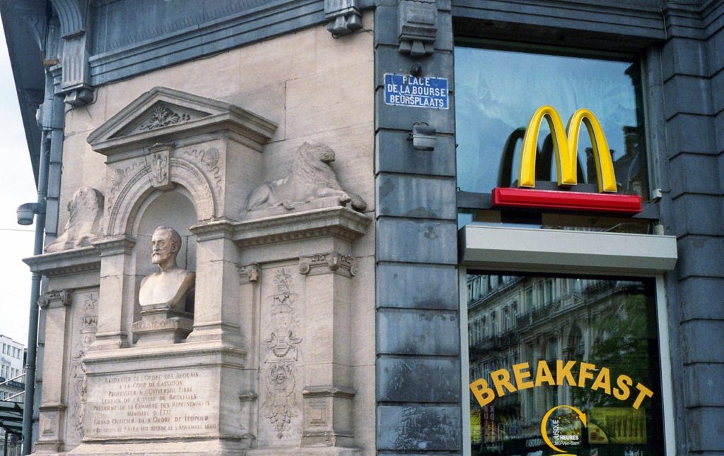
Everyone knows those golden arches, which as we now know, the colour evokes joy and happiness. McDonalds wants you to feel happy when you see it.
Added to their red background colour makes the brand have a sense of urgency and desire. Think about the last time you had a McDonalds; it was probably a spur of the moment decision rather than a long thought out one.
FedEx

The FedEx logo is made up of two colours. Purple, highlighting luxury, or in this case, quality service and orange for affordability. Showing that this company provides high quality service at affordable prices.
Coca Cola
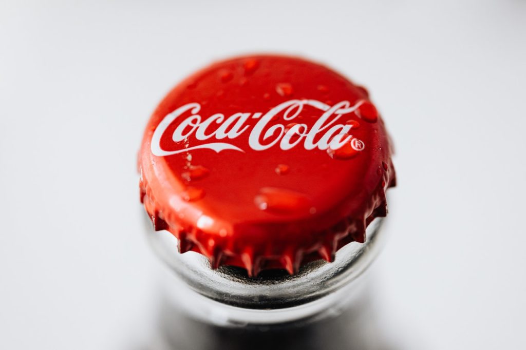
This soft drink giant clearly wants you to drink their beverage, so what colour do they go for? Red of course, they want to evoke desire and impulse in you to buy their drink and they want you to fall in love with it. This makes it the perfect colour for the brand.
As you can see brand colour palettes are just as important as the brand values if not more so. This is the first thing your consumers may see so you want to evoke the right feelings to encourage them to buy into your brand.
Generate Uk is a full service B2B digital marketing agency based in Theale, Reading, Berkshire.
We understand the importance of branding and how to use colours to accentuate and highlight your values. We can help you with all aspects of your marketing from branding to SEO.
Speak to us today to find out how we can help support your brand.